
Tencent
OVERVIEW
During the summer of 2023 I interned at Tencent’s Interactive Entertainment Group (IEG) as an interface and interaction designer. The majority of my work involved creating HTML5 visuals and fine-tuning UI/UX for the Tencent Games Joy Club mobile app, which I am unable to share. However, I was also assigned a separate solo task of a complete overhaul of the B2E recommender system used to promote content across all Tencent gaming apps. On this page I will go through snippets of my redesign of the Dora Platform, a formerly-in-bad-shape web app actively used by 500+ employees.
TOOLS
- Photoshop
- Figma
- Midjourney
DURATION
2 months
SELECT OLD UI SCREENSHOTS

THE PROBLEM
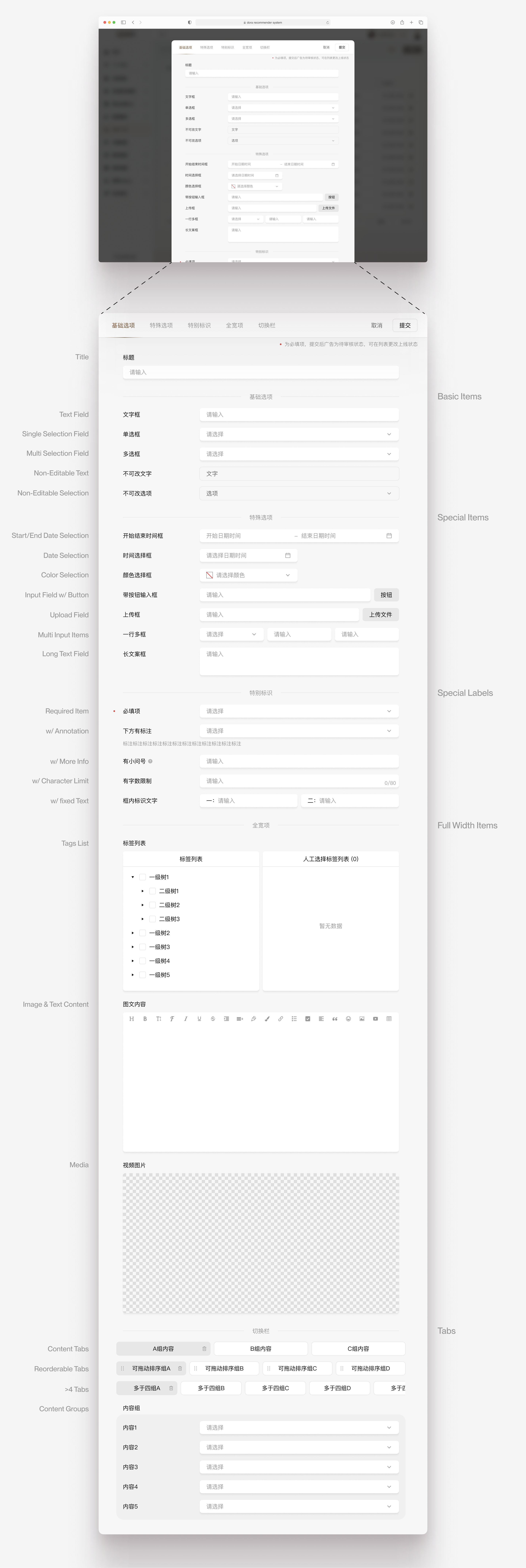
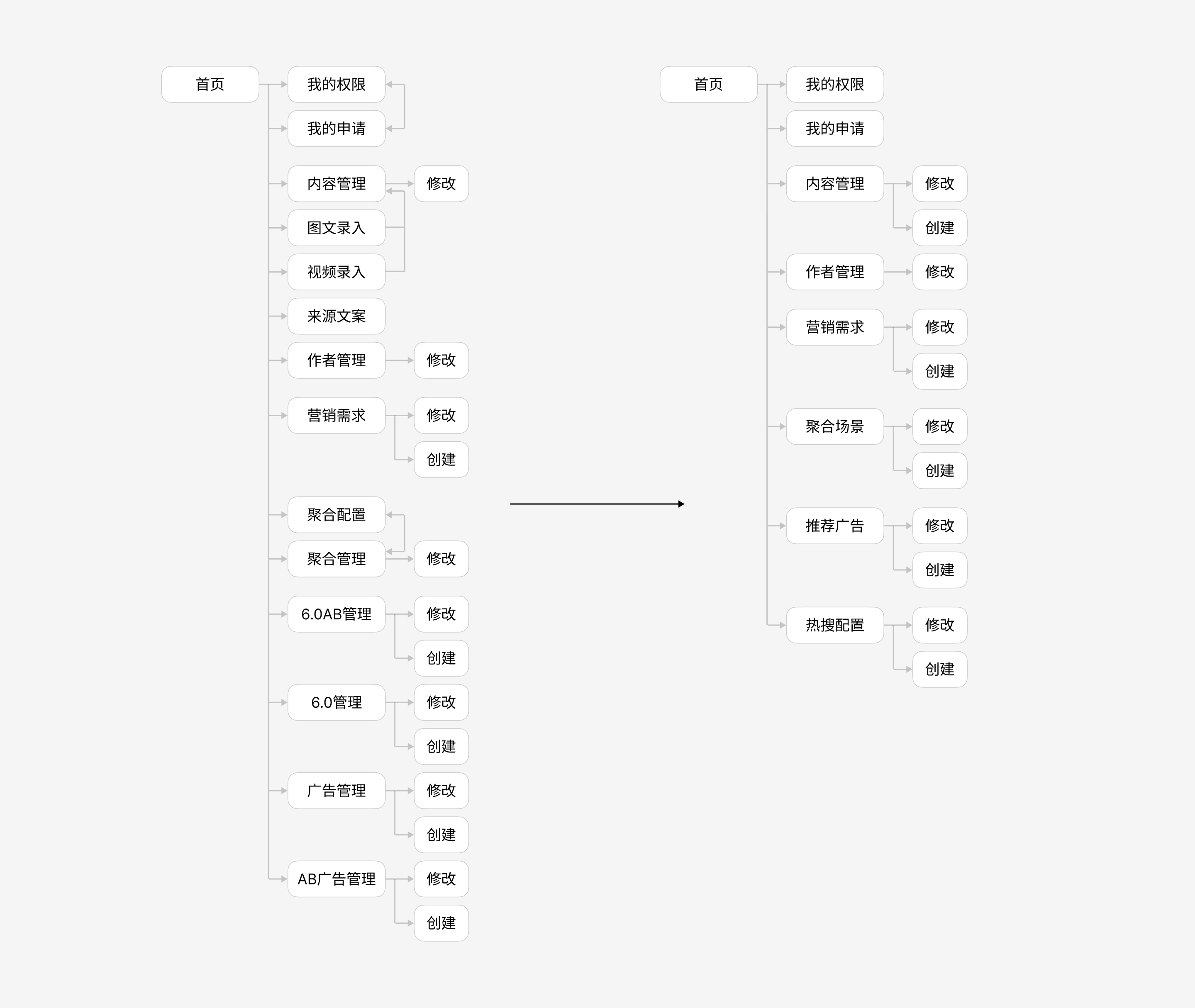
The UI is very outdated, with almost no consideration for reponsiveness, scattering out the layout and creating overflows when the window is even slightly adjusted. The UX went through many bandaid solutions, resulting in stray buttons and links that serve the same purpose or point to the same pages, making navigating through the forms very confusing. The design under each section is also quite different as each section was worked on by different engineers at different times without a designer overseeing the conformity.
UX RESTRUCTURING
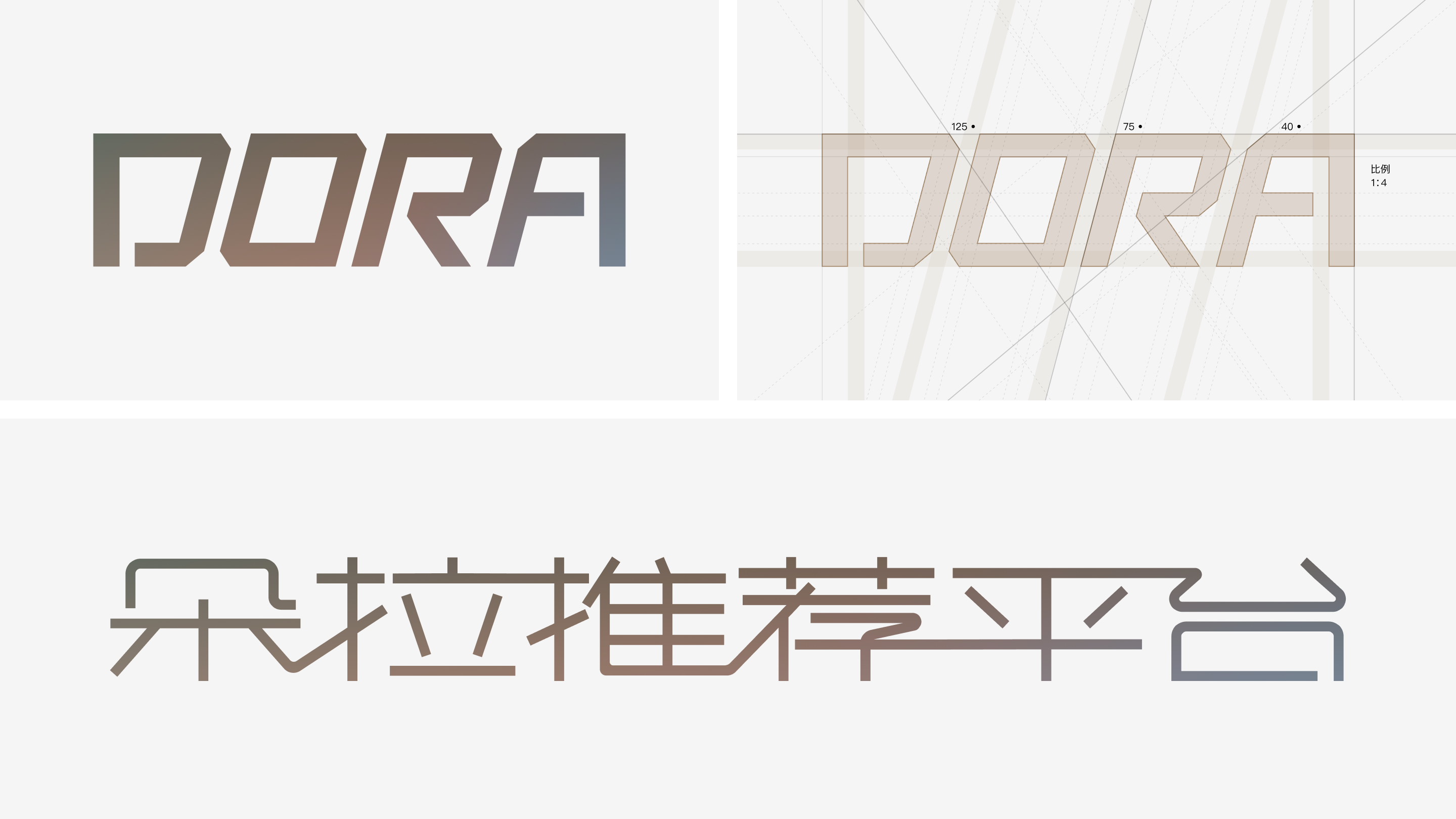
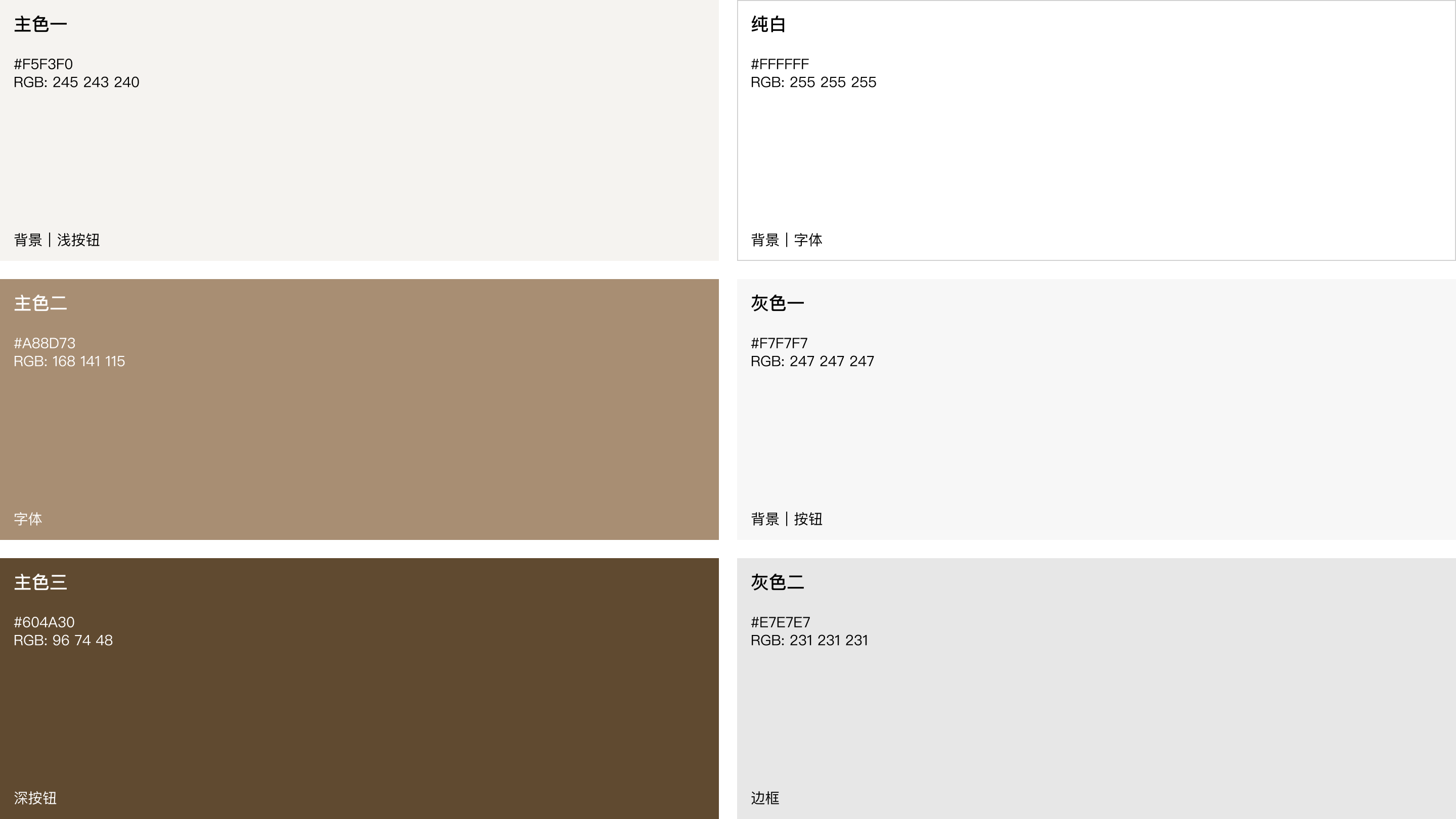
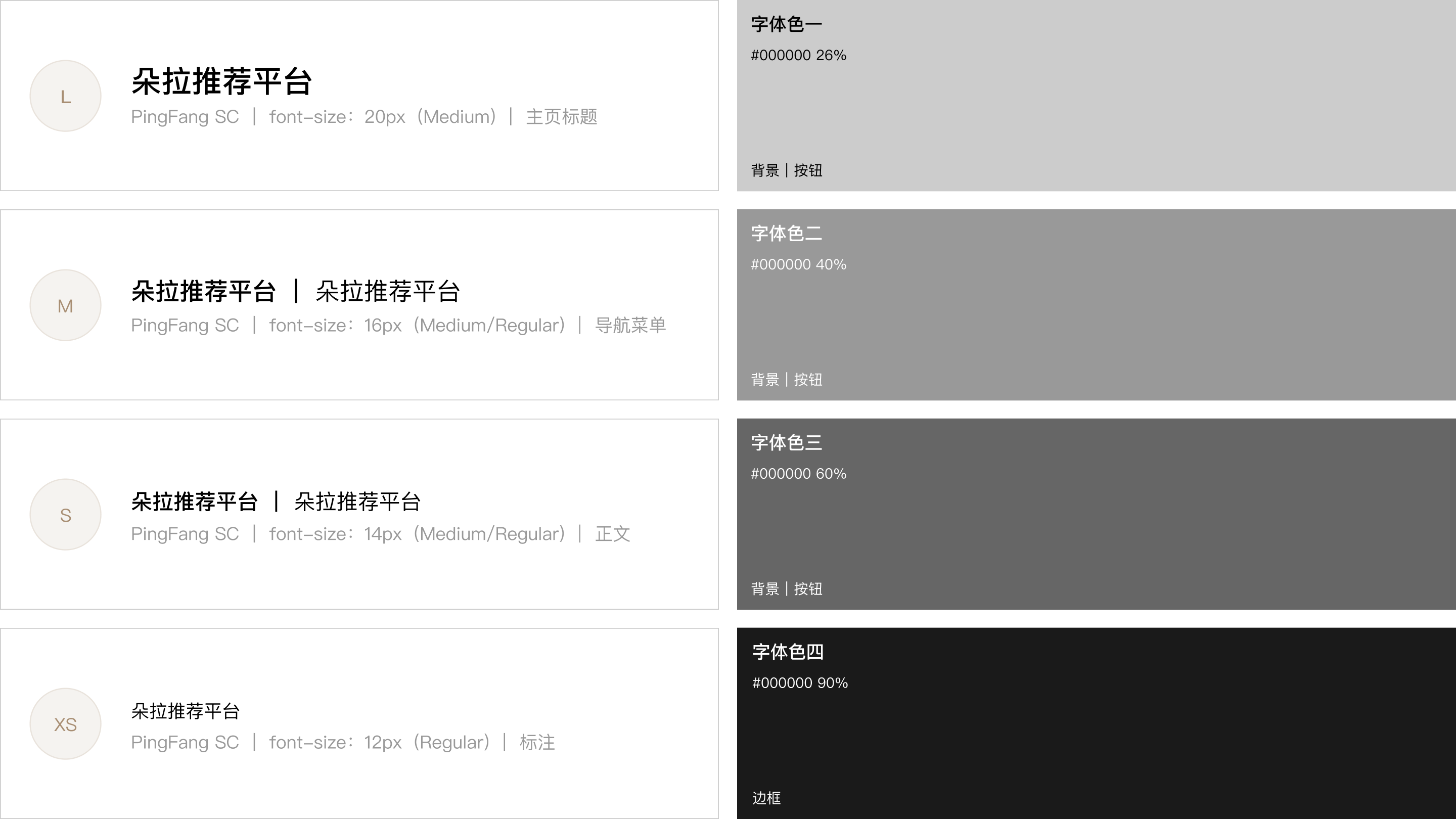
NEW STYLE GUIDE

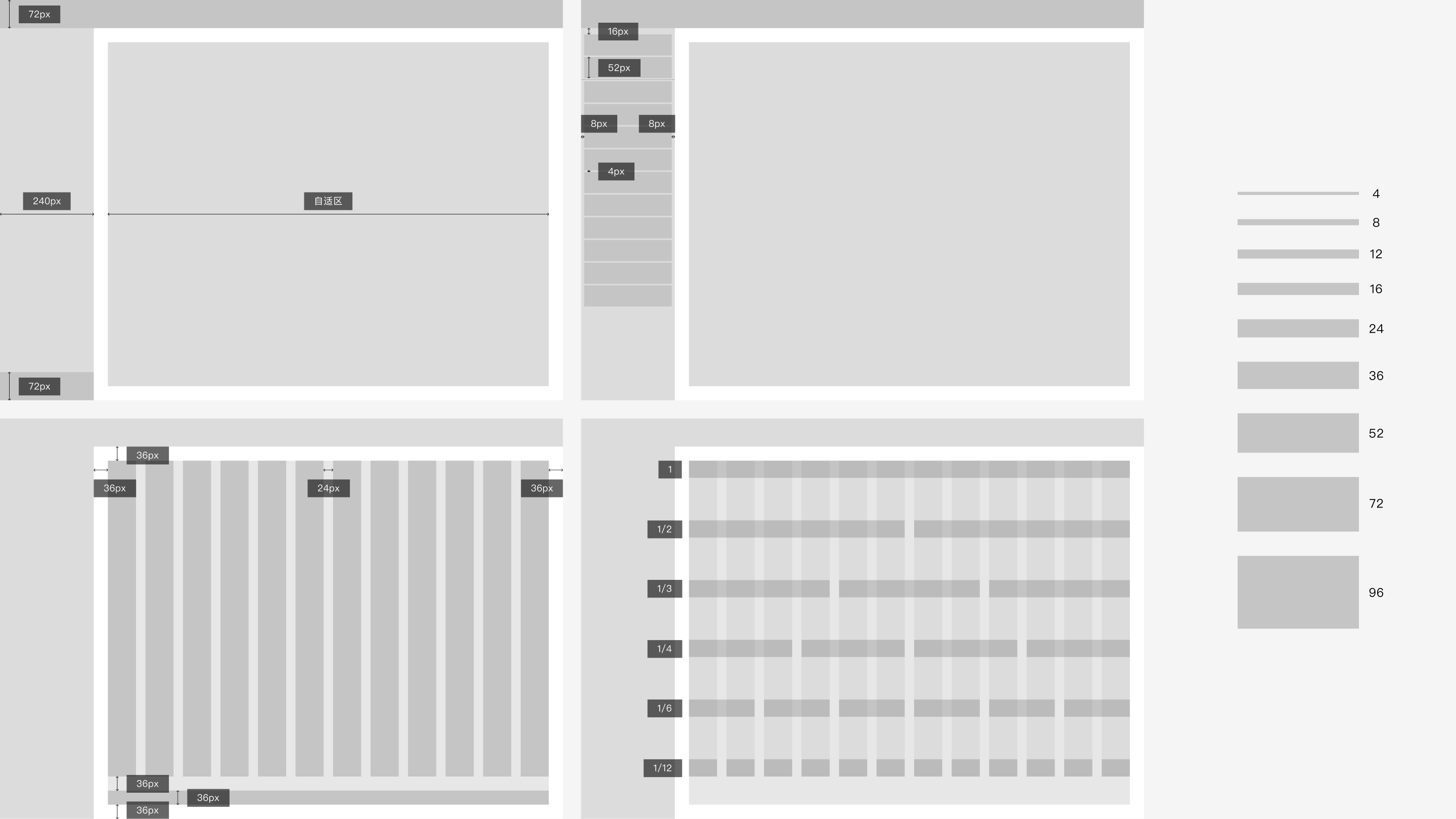
RESPONSIVE LAYOUT GRID
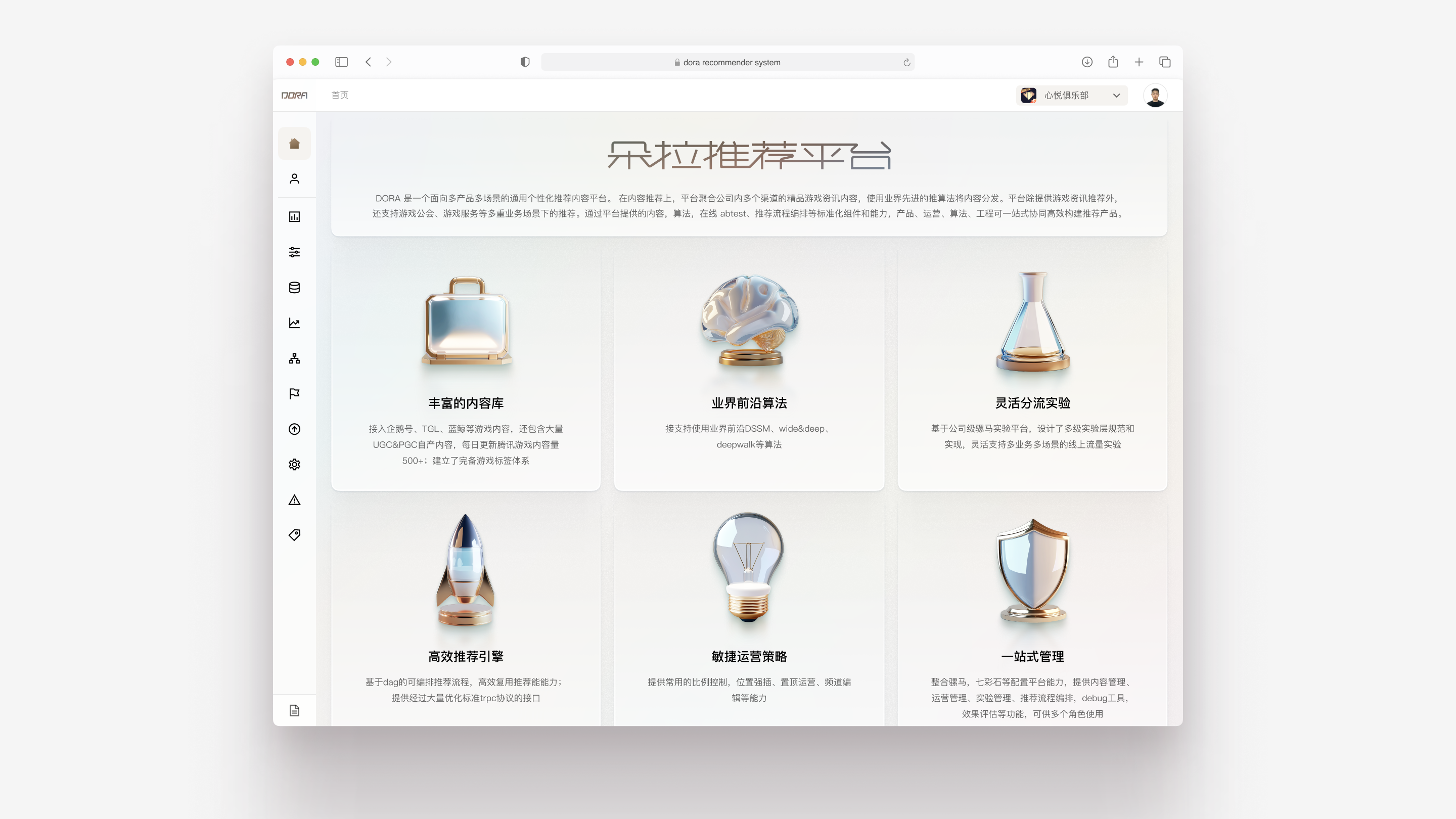
HOME


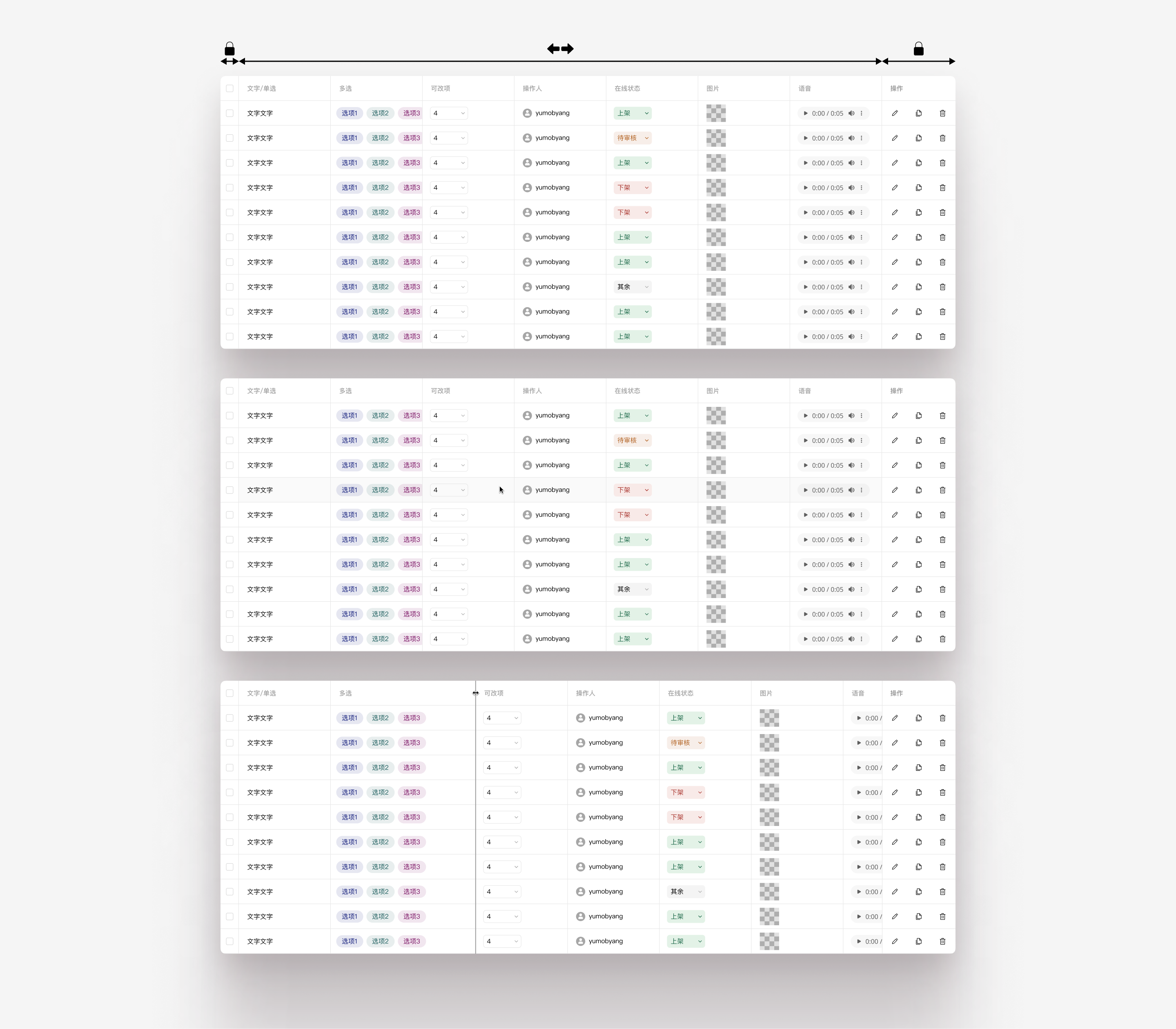
TABLE
FORM
NAVIGATION
