

- Design Systems
- UI/UX
- Figma
- Philippe Wu
- Christina Su
- Muchen Guo
CONTEXT
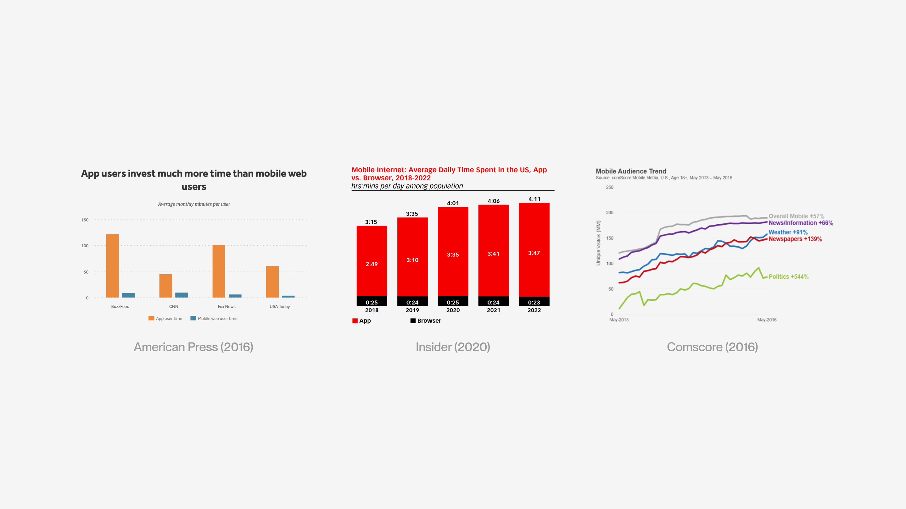
Columbia Daily Spectator is the second-oldest college daily paper in the United States. Spectator’s Engagement analytics report an increasing consumption of Spectator articles on mobile devices, with more and more users being directed to the Spectator’s mobile website from the organization’s instagram posts.
However, a quick scan of the CDS website on mobile phones yields many problems. The visual layout on a desktop does not translate well onto a smaller screen, resulting in the mobile interface being filled with inconsistent and clunky elements.
Visual Issues:
- • Misaligned headers
- • Messy visual hierarchy
- • Overabundance of fonts
Interactive Issues:
- • Tiny clickable elements
- • Frequently used navigation button placed at a hard-to-reach corner
Thus, the product team at Spectator began ideating a different news viewing experience to replace the web browser: a mobile app.
OPPURTUNITIES FOR IMPROVEMENT
User Interaction
- • Easier to access
- • Easier to browse
- • Easier to share
Expanded Functionalities
- • Story-telling through more specific sections and subsections
- • Tighter integration between print and mobile formats
- • Customizable notifications System
- • Personalization of feed
- • Offline Reading
Potential Impact
- • Increased user activity (people on apps spend more time)
- • Increased brand influence & mobile presence
DEMAND ANALYSIS
Do people want a mobile app?
We sent out surveys with both discreet and explicit questions about news consumptions
- • To Spectator Staff (they spend half their life on the spectator website and have a full understanding of the site down to its tiniest problems)
- • To other Columbia undergraduate students (our main target audience, who can provide good general feedback for the current method of viewing Spectator news)
We also found Existing Research on mobile app demand and trends from American Press(2016), Insider(2020), Comscore(2016), etc.
COMPETITIVE LANDSCAPE
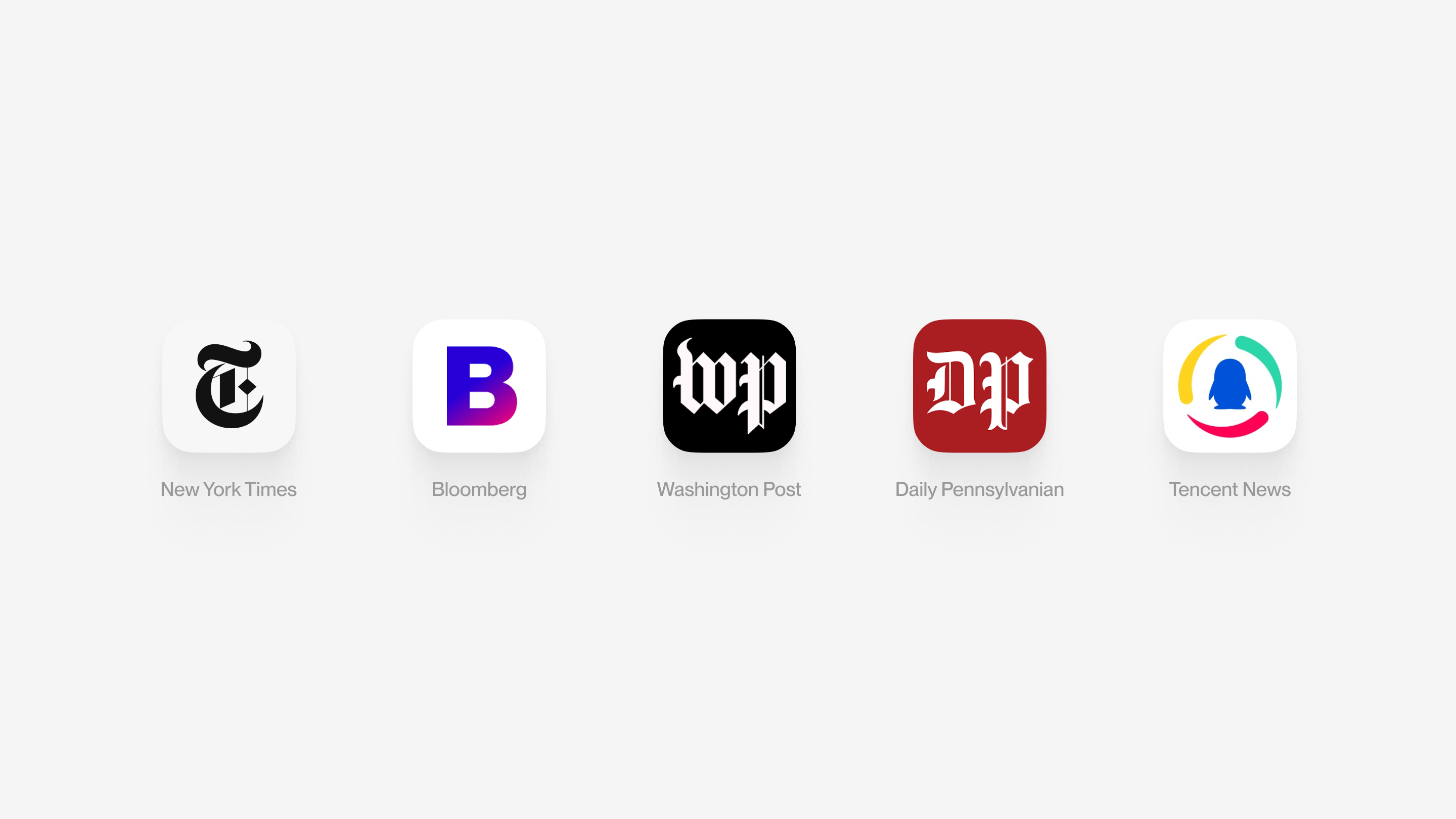
We looked into other successful news delivering apps to gain a better understanding of the mobile iteration of news content and to get inspired with new feature ideas: New York Times, Bloomberg, Washington Post, Daily Pennsylvanian, Tencent News.
Together with the results we received from surveys, we now have a good understanding of what features to prioritize for the 1.0 version of our MVP, all to construct a personalized and customizable experience for the users:
- • Restructuring the navigation, including the process of section-subsection exploration and the placement of image & text content.
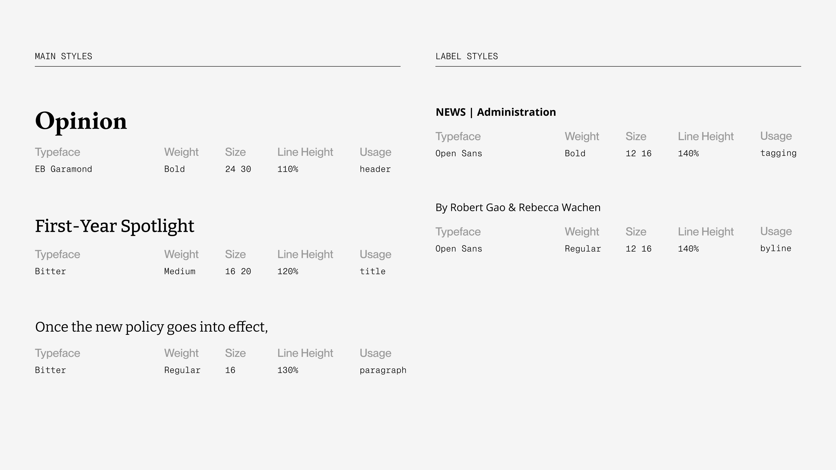
- • Cutting down the number of fonts (EB Garamond, Bitter, Open Sans, Merriweather, Lato, Playfair Display, Neue Haas Unica)
- • Designing easy sharing and saving functionalities
- • Categorizing articles by tags and subtags
- • Adding in accessibility settings
STYLES REVAMP
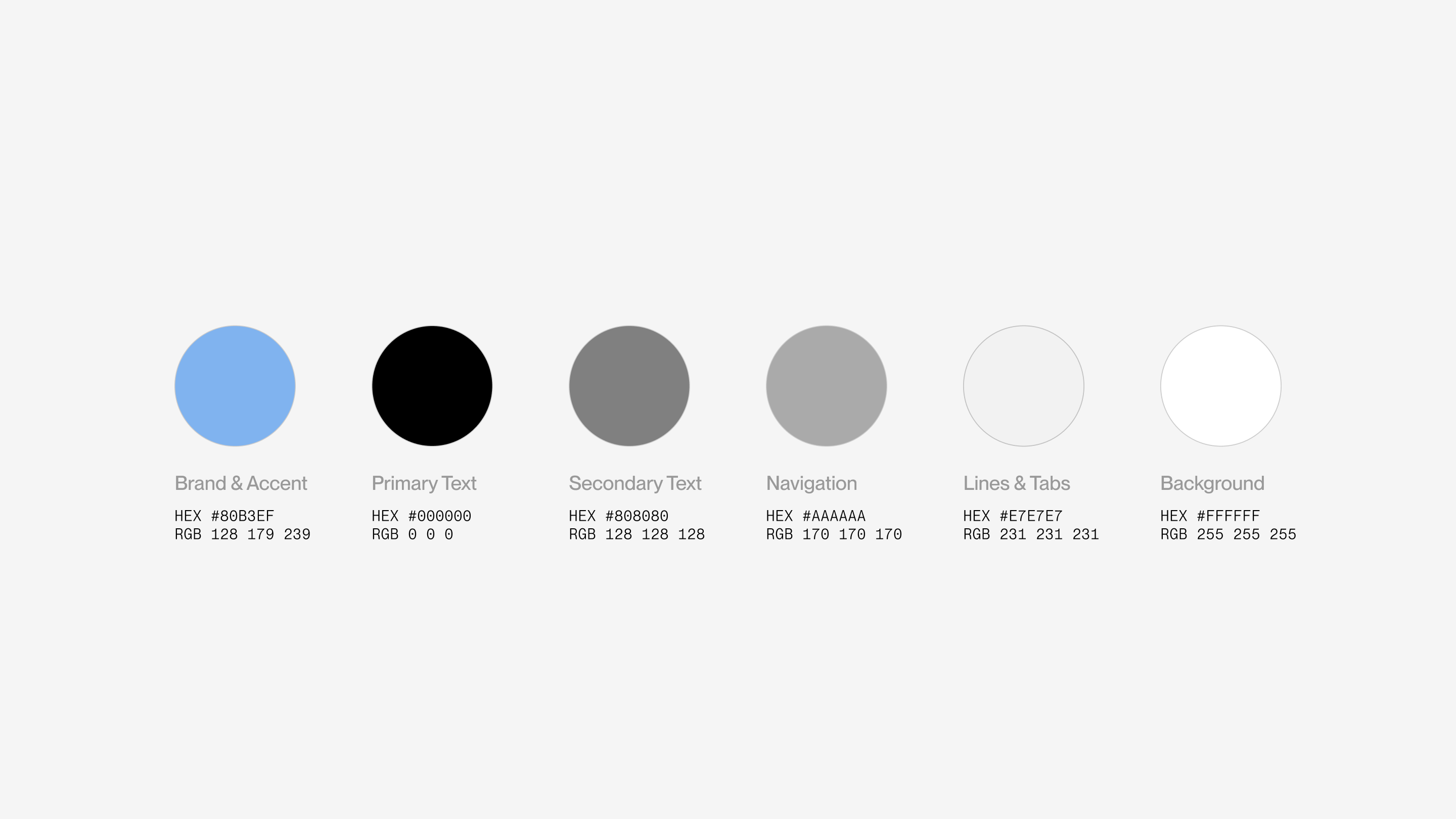
I simplified the palette from the CDS website to the brand color and 5 greys, and the font library from 7 to 3 type families. The cleaner result with more consistency is still able to preserve the visual hierarchy and page weight of the familiar interface.
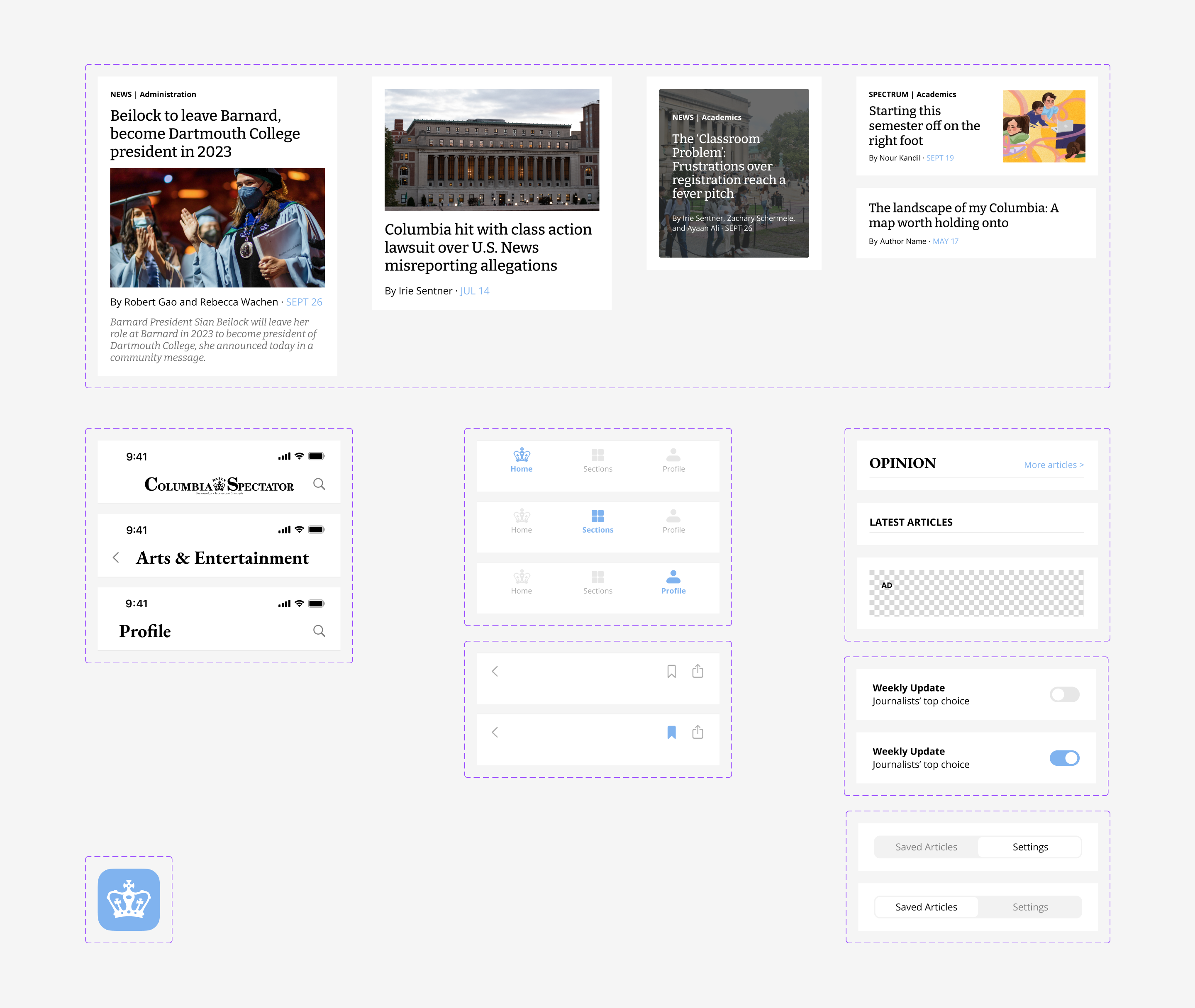
DESIGN LIBRARY
Visual components for article layouts and a brand new articles navigating interaction.
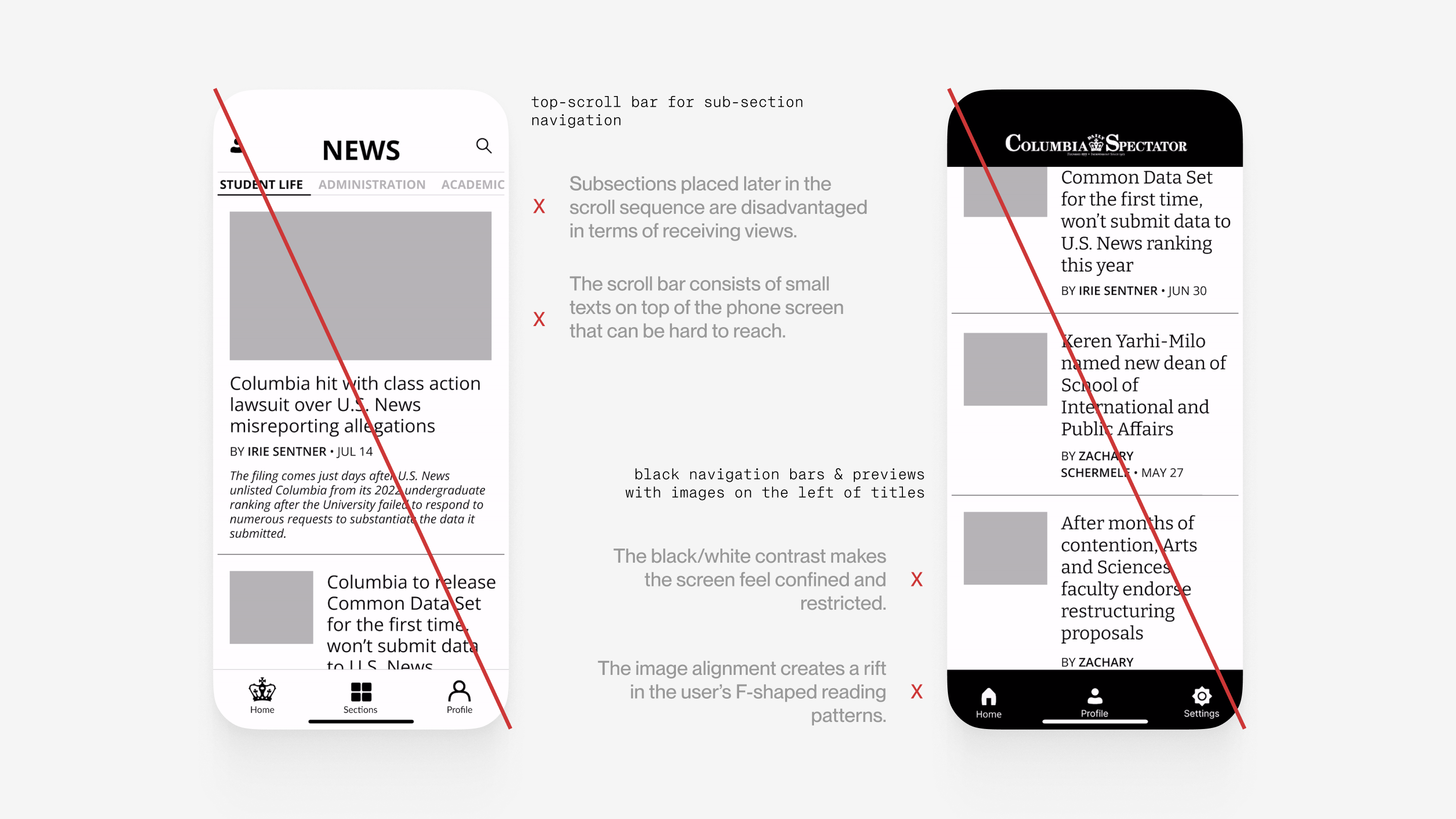
ALTERNATIVE DESIGNS
Our UX went through multiple iterations during the mid fidelity prototyping stage that ended up being scrapped for various reasons. Here are 2 of many.

A proposal for a top-scroll bar for sub-section navigation was rejected because:
- • Subsections placed later in the scroll sequence are disadvantaged in terms of receiving views.
- • The scroll bar consists of small texts on top of the phone screen that can be hard to reach.

An inital UI of black navigation bars and previews with images on the left was replaced because:
- • The black/white contrast makes the screen feel confined and restricted
- • The image alignment creates a rift in the user’s F-shaped reading patterns.
FINAL HIGH FIDELITY PROTOTYPES
Home
Sections
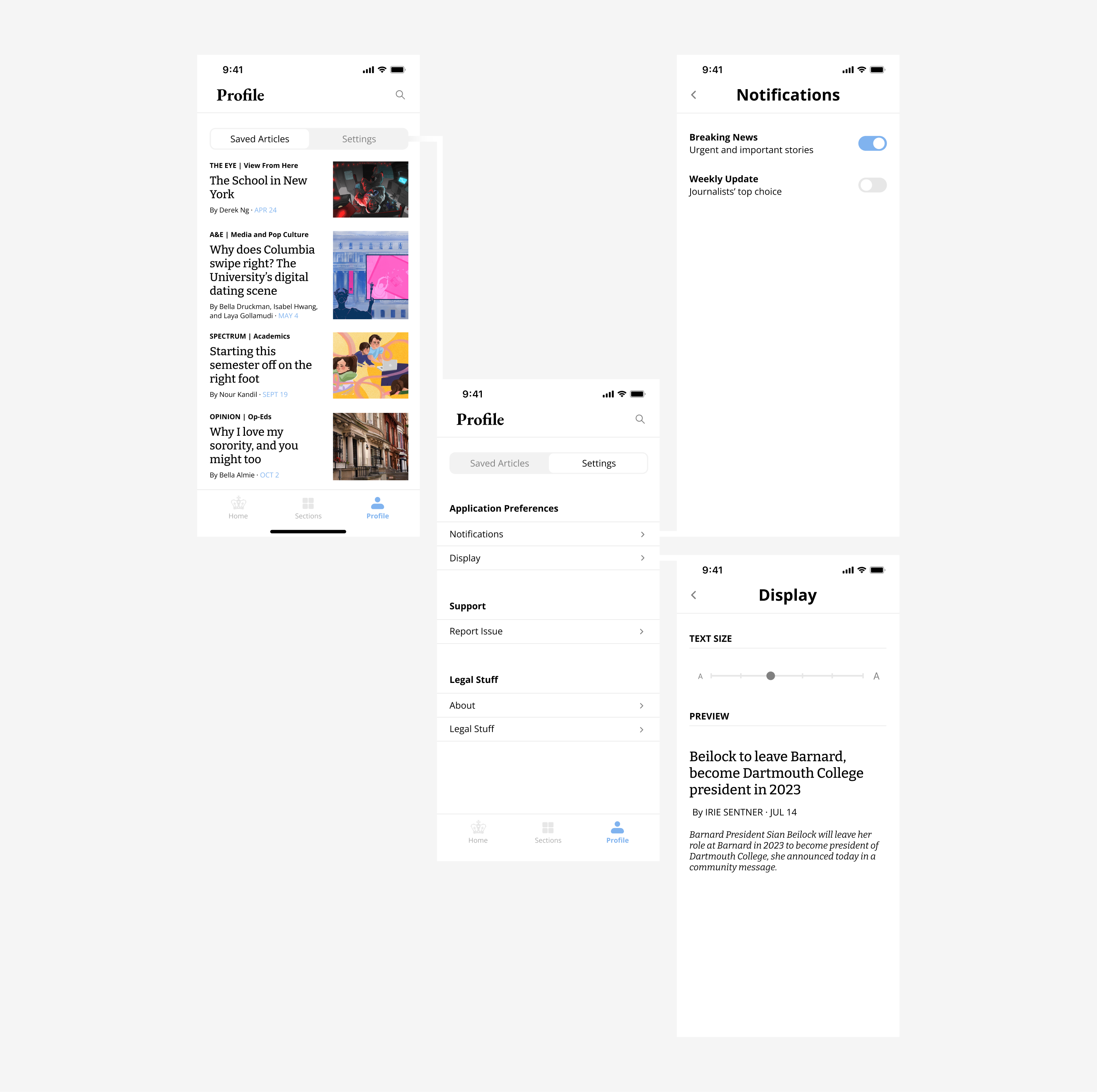
Profile

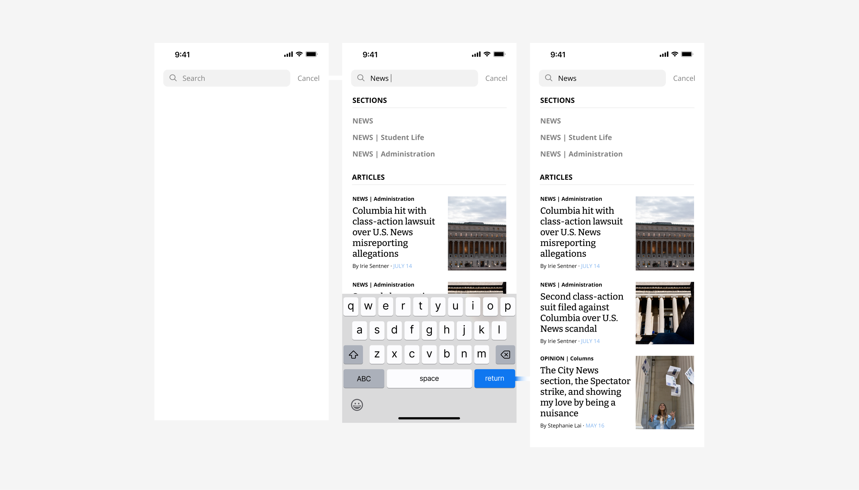
Search
